To meet the San Francisco Foundation’s (SFF) goal of reflecting our community and bringing visual power to our communications, we introduced a bold new look that was a significant departure from our previous visual identity. This post is a closer look at the process of revitalizing the SFF visual identity and the nitty gritty design details of our new look. Read the official announcement post about the general strategy behind this shift here.
What can we improve?
Anyone looking closely at our visual materials the last few years may have felt the same disconnect I did when first joining the foundation. Our red-box logo and black-and-grey palette were striking, yes, but did they really reflect our work and our values? The people behind the box were much warmer, welcoming, and passionate about community and equity in the Bay Area.
We evaluated our identity system with the help of staff and trustees to understand their feelings about our current logo and what I needed to focus on foremost in the redesign. In summarizing our challenges with the existing system, I highlighted three key areas for improvement:
| PAST LOOK… | NEW LOOK… | |
| 1 | feels sophisticated and strong, but too “corporate.” | needs to reflect our spirit and connect with our community. |
| 2 | difficult to use, with only one logo lockup regardless of application. | needs to be more flexible, with multiple orientations and versions. |
| 3 | uses widely varied sub-brands and initiative logos. | needs to house multiple sub-brands comfortably and cohesively. |
The creative process
After assessing our materials and setting a baseline for satisfaction with our past look, I embarked on a design process to rethink our mark. The first phase of exploration resulted in nine distinct identity concepts ranging from a slight evolution of the red box to total departures with no box in sight. Our internal strategy team narrowed these concepts to four, then, with additional refinements, four became two.
We then opened the floor to those who use, promote, and interact with our brand. I reviewed our final two concepts with all staff and trustee leadership, then with external stakeholders, including grantees, professional advisors, and other partners. With their insightful feedback, two concepts finally became one. Revisions were made until we produced a finished product we felt strategically met our challenges and excited our partners. Bringing others into the fold gave us clarity on how the new look might be received and resulted in improvements to the form of the logo and more vibrancy than in the initial concept.
A logo of many layers
Remember that range of concepts, where some options were a complete departure? The winning design was one of them. We needed something bold that defied expectations.
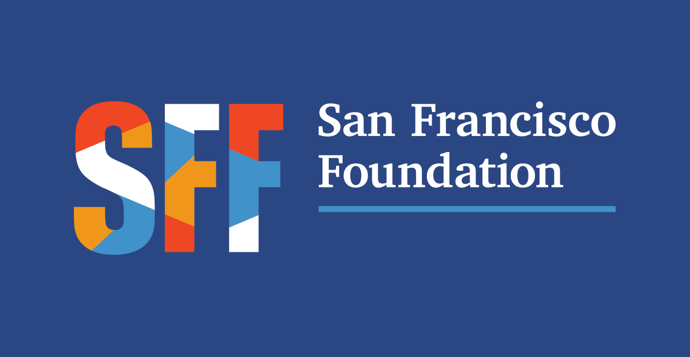
The name of this concept in our creative review was “Many-Layered,” named so because of the dynamic, interconnected patchwork contained inside SFF. With many pieces coming together as one whole, it embraces the complexity inherent to a large community foundation.
We are by nature a robust institution—with many layers to our work, many roles we play in the community, and many strategies and focus areas working in tandem to achieve our regional equity goals. We are a convener, layering our expertise with that of partners, donors, and community leaders to make a greater impact. And most importantly, we honor and uplift diverse voices and communities in the Bay Area, all of which are essential to the strong and vibrant whole.
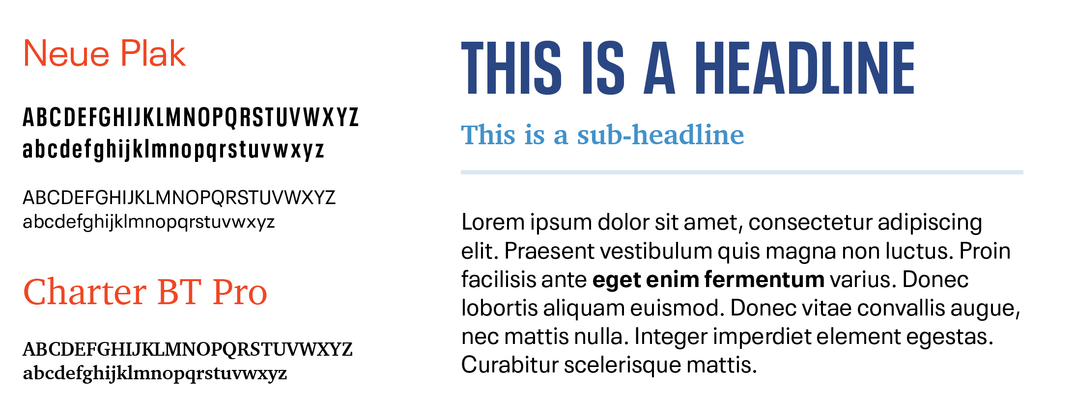
We paired this vibrant patchwork acronym mark with a refined serif typeface that still has weight and edge. As an organization, we are a balance of this momentous energy plus the expertise earned through our history as one of the oldest community foundations in the country, with generations of professional respect built in the field.
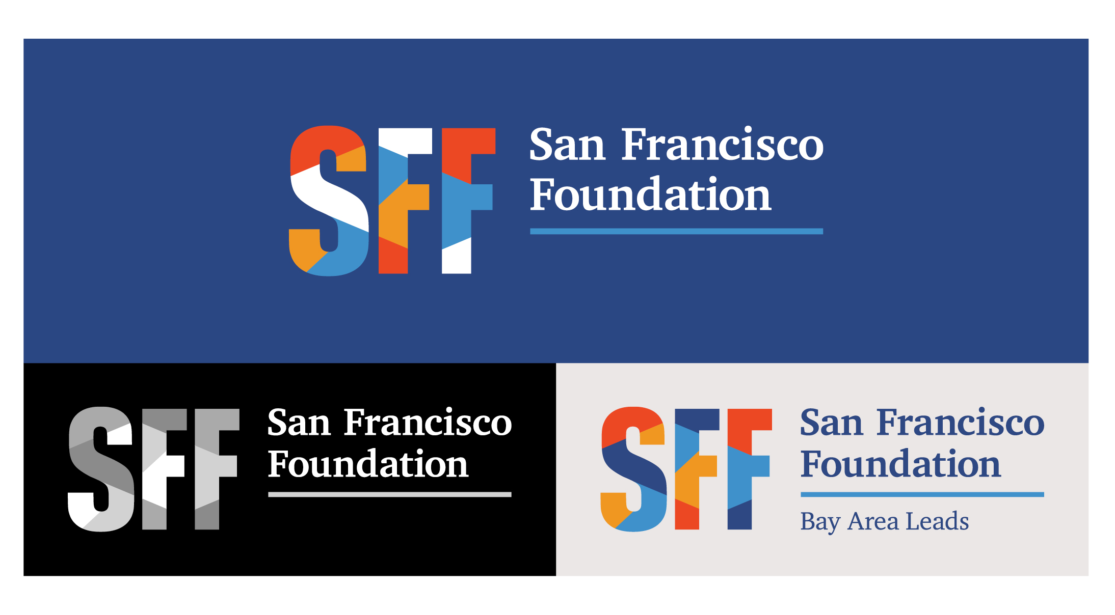
The logo is designed to accommodate sub-brands consistently and seamlessly, building a strong association between these initiatives and the overarching visual identity. It’s also built with flexibility of application in mind, with reverse, grayscale, one-color, and reduced size versions.
Bringing the identity to life
A logo without an underlying visual system is like a car without wheels—it might look nice but doesn’t end up going anywhere or achieving the purpose you bought it for in the first place.
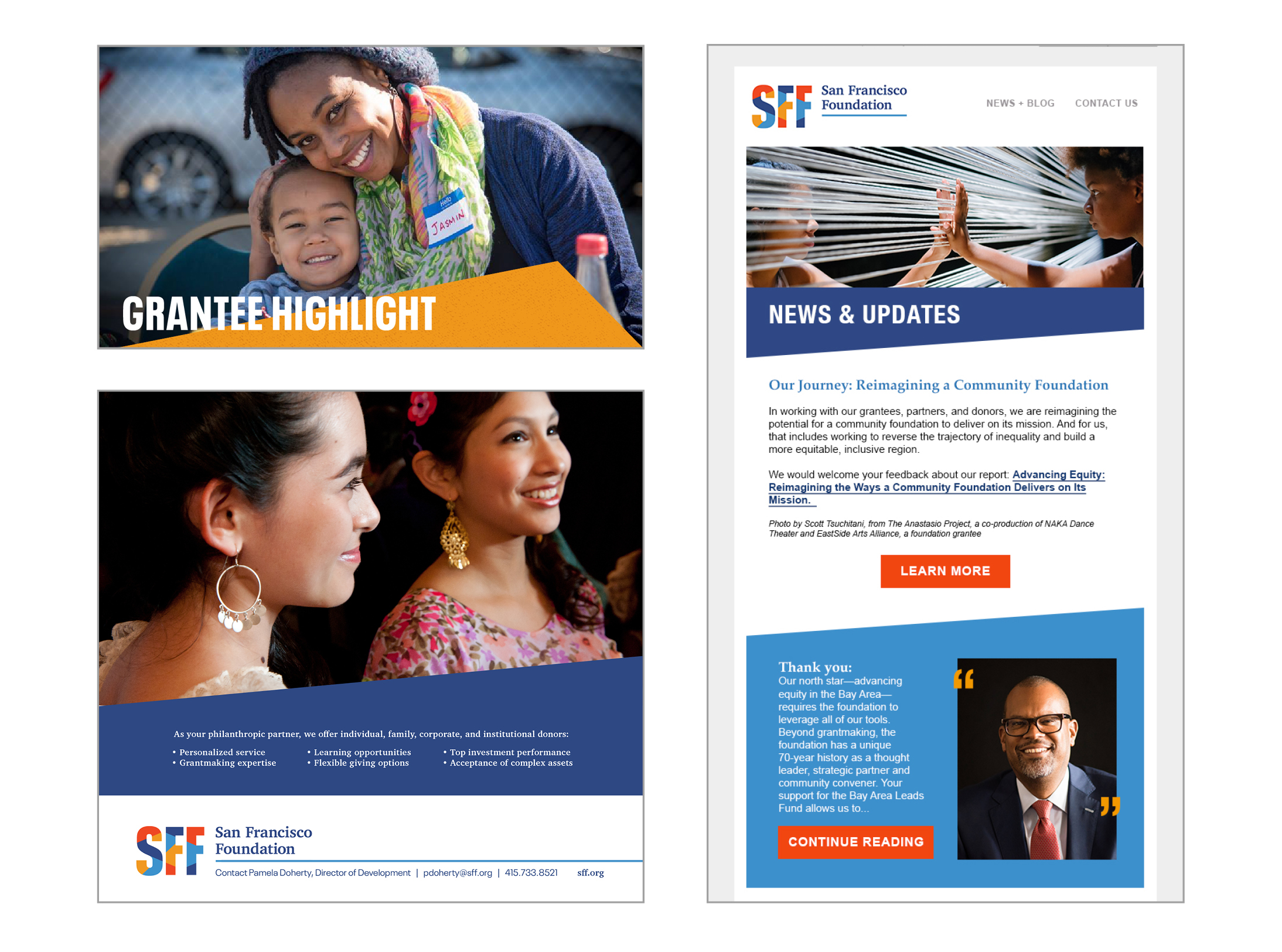
The identity system includes a toolkit of supporting elements and style cues that define the new look of our communications. These elements expand the visual language of our materials, adding depth and flexibility:
A fresh, bright, and expressive color palette—to represent the vibrant spirit of the San Francisco Foundation and our diverse community. The orange-red hue is a warmer and brighter nod to the red of past logos.
Bold typography—a balance of power and refinement for impactful communications
Dynamic angles—to define and give energy to our layouts
Accent patchwork pattern—an exuberant polygonal pattern that complements the geometric lines in our logo and inspired a new icon treatment
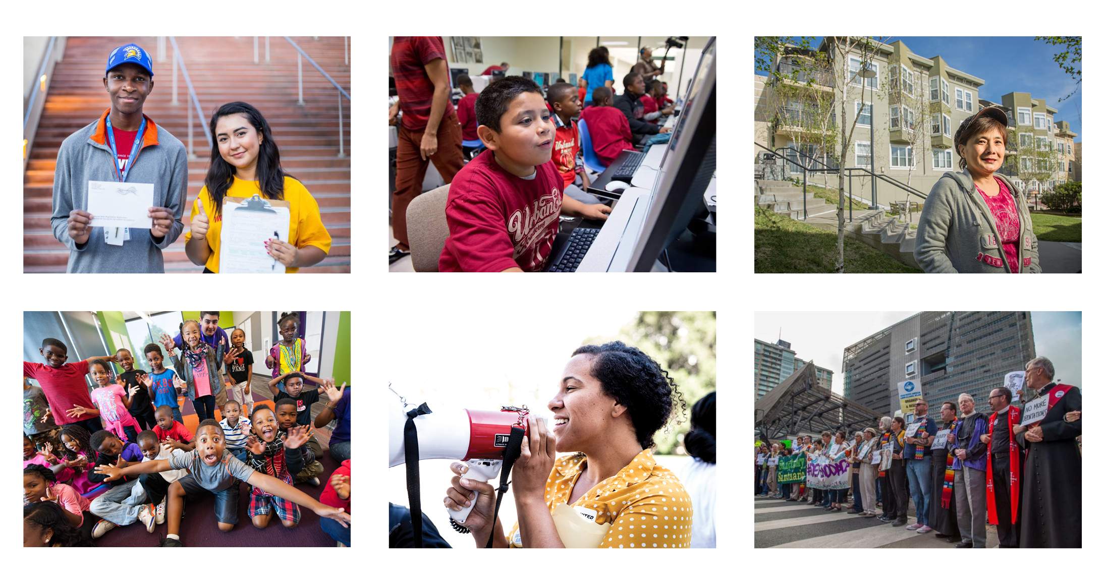
Excellent, authentic photography—we strive for diverse, high quality images that honestly reflect and honor our communities as they are, with an intentional focus on people of color. If you’re a grantee or partner and have great images you’d like us to feature, please reach out to us.
With thoughtful and consistent use, this system will establish greater recognition and awareness of SFF.
A streamlined web experience
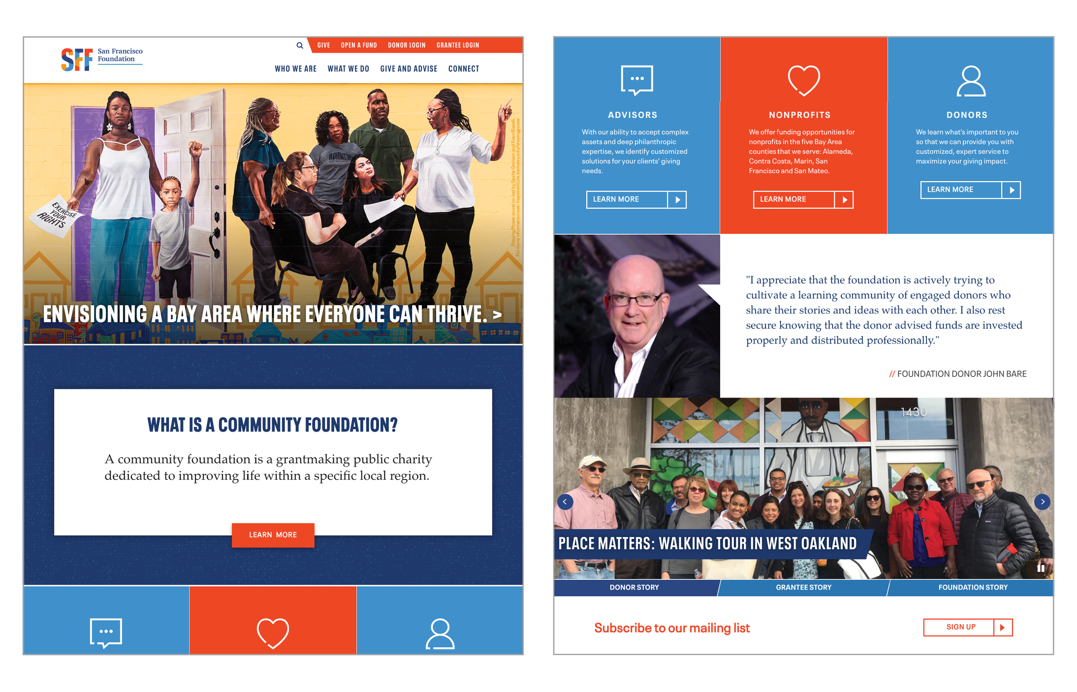
Over the coming year you’ll see more updated materials and messaging with our new look. First and most accessible is our new website, which launched today. The new look works harmoniously with our visual identity system and presents our most relevant and useful content alongside community profiles and powerful storytelling.
Radical imagination
At SFF, we know this generation of philanthropy is challenged with critical decision points for our region and our actions will define what type of future we want to create in the Bay Area. Communicating our commitment to racial equity and economic inclusion is an important aspect of forging vital partnerships, strengthening existing relationships, and energizing the community engaging in this work with us. Our new visual identity system is built in support of our equity agenda and commitment to engage like-minded leaders in a way that truly reflects our values.
Special thanks goes to SFF leadership, staff, and our partners, all who lent their time, insight, and enthusiasm to this process. Thank you for keeping us on the path to truth and making your mark on this new direction.
For questions or comments, please contact: [email protected]

