I was drawn to the San Francisco Foundation (SFF) for two main reasons. First—which may be obvious if you’re familiar with SFF—is that the organization is a force for good and being here is an opportunity to contribute to something positive and much-needed in our time.
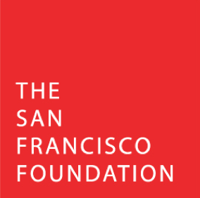
Second was the significant design challenge that I faced as soon as I came on board: how could the SFF brand evolve to be even more inclusive and communicate our message? Anyone looking closely at our visuals from the last few years may have felt the same disconnect I did—our red-box logo and black-and-grey palette were striking, yes, but did they really reflect our work and our values? The people behind the box were much warmer, welcoming, and passionate about community and equity in the Bay Area.
In 2016, the foundation took bold steps to establish equity as our north star, making a commitment to racial equity and economic inclusion. Since then, we’ve made strides in viewing our work through an equity lens—structuring our grantmaking into interconnected equity-focused priorities, working with an increasing number of donors to support aligned causes, investing $50 million in a new mission-aligned investment pool, and engaging in cross-sector partnerships and policy work to advance equity in the Bay Area.
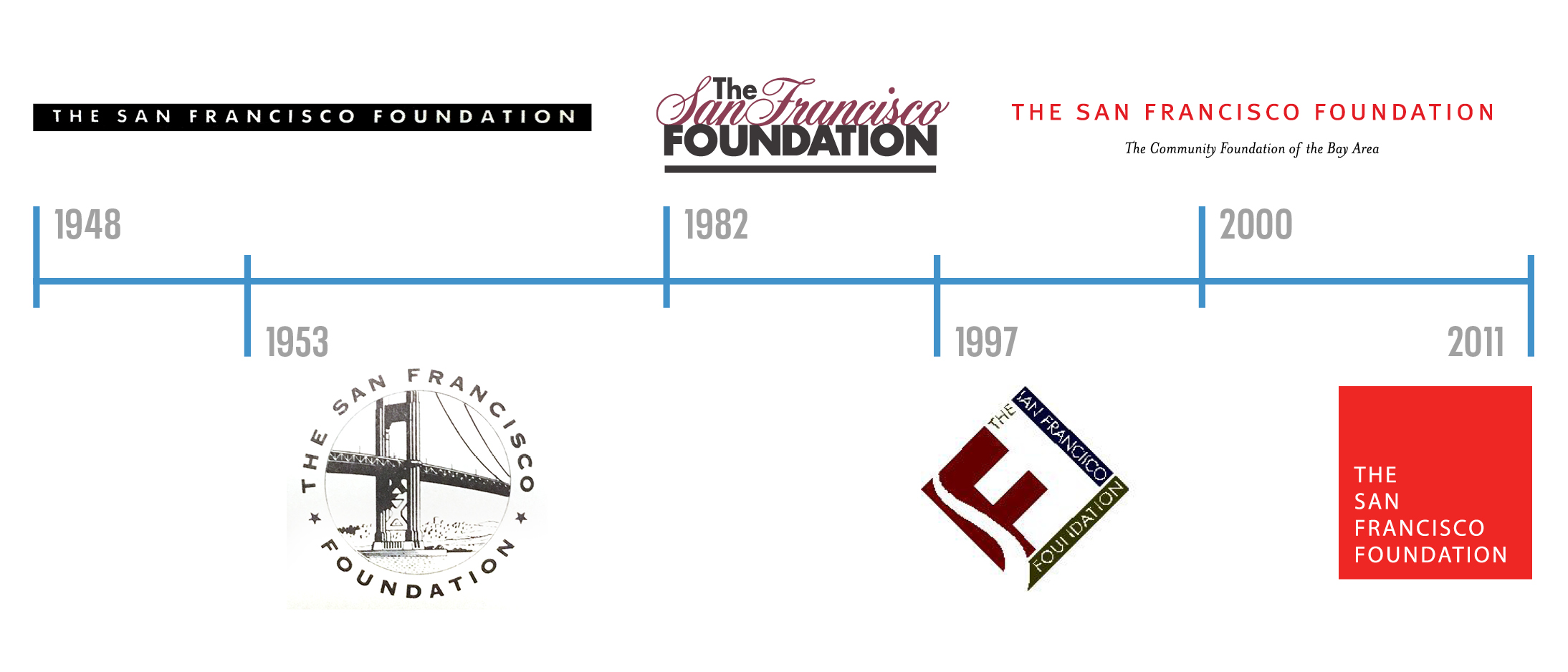
Today, we are taking one more important step to demonstrate who we are and what we value. We are launching a new visual identity and website that are imbued with our commitment to community and to equity. In the foundation’s 71-year history, we’ve seen several logos come and go. They have served us well, and helped us support tens of thousands of nonprofits in the Bay Area, partner with donors in the region, and use our voice and influence to address the issues confronting our communities. But with this shift in focus, rebranding was an opportunity to build on our legacy while strengthening outreach in the community and bringing in new audiences.
Visual evolution of the San Francisco Foundation:
We began this process almost exactly a year ago, when I first joined the foundation. First, we internally evaluated our identity system and determined our priorities for the new look: it needed to better reflect our spirit and connect with our community.
The design exploration phase resulted in nine distinct identity concepts ranging from a slight evolution of the red box to total departures with no box in sight. Aside from staff and trustees, we reached out to grantees, professional advisors, donors, and other partners. With their insightful feedback, we were able to select and refine our final concept:
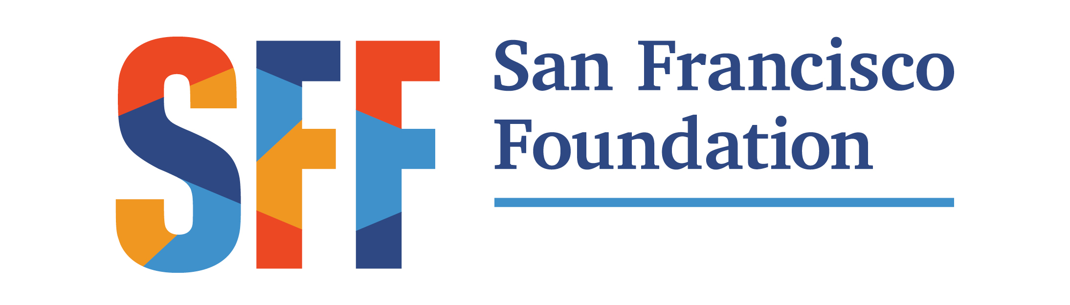
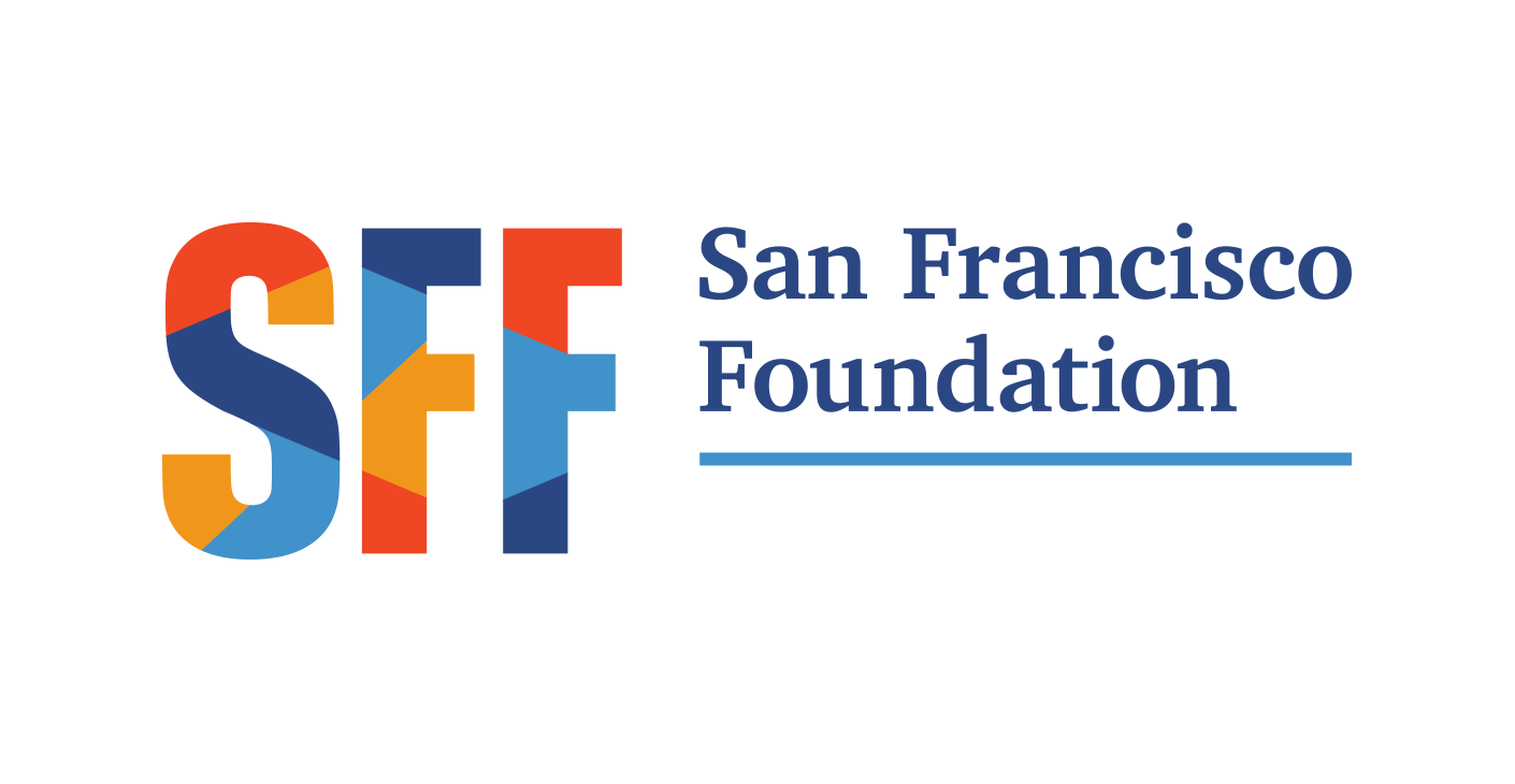
To meet our goal of reflecting our community and bringing visual power to our communications, we’re introducing a bold new look and significant departure from our previous visual identity. During our creative process, we had referred to this as our “Many-Layered” concept, because of its dynamic, interconnected patchwork. With many pieces coming together as one whole, it embraces the interconnectedness at the heart of a community foundation. We are a thought leader, convener, and partner to nonprofits, donors, and community leaders, who together help us make an impact on the issues we care about most. And most importantly, we honor and uplift diverse voices, all of which are essential to building a strong and vibrant Bay Area.
A logo without an underlying visual system is like a car without wheels—it might look nice but doesn’t end up going anywhere or achieving the purpose you bought it for in the first place. Our new identity system includes a toolkit of supporting elements and style cues that define the new look of our communications. These elements expand the visual language of our materials, adding depth and flexibility. With thoughtful and consistent use, this system will establish greater recognition and awareness of SFF and the issues we are tackling.
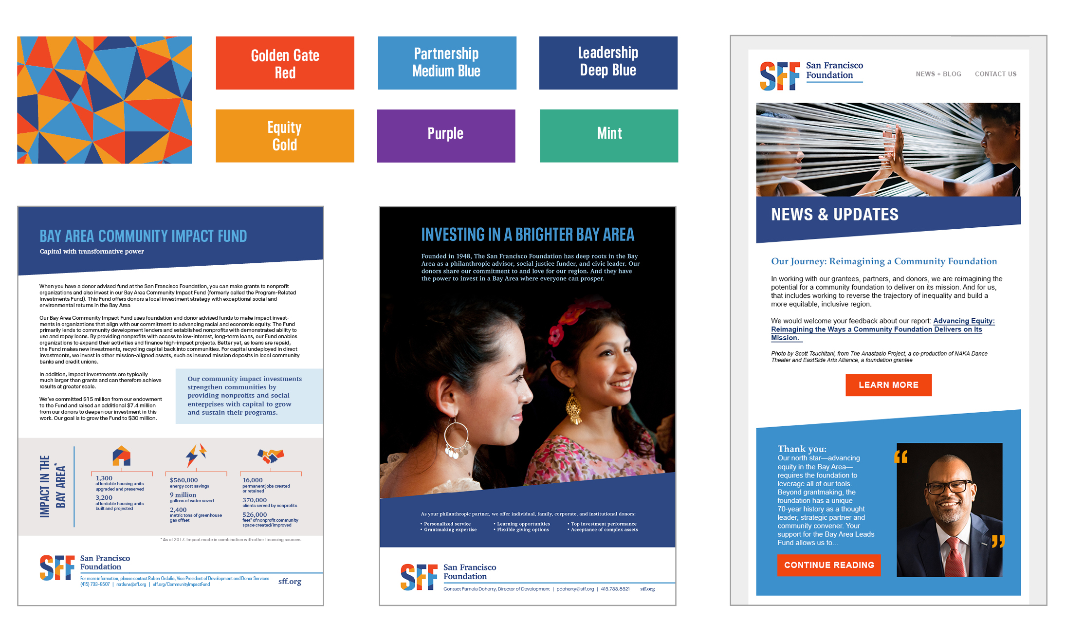
Over the coming year you’ll see more updated materials and messaging with our new look. First and most accessible is our streamlined new website, which launched today. The new look works harmoniously with our visual identity system and presents our most relevant and useful content alongside community storytelling.
By ensuring that everyone has a safe and affordable place to call home, real access to economic opportunity, and a strong political voice, we can make this a Bay Area for all. Our new visual identity system is built in support of our equity agenda and commitment to engage like-minded leaders in a way that truly reflects our values.
Special thanks goes to SFF leadership, staff, and our partners, all who lent their time, insight, and enthusiasm to this process. Thank you for keeping us on the path to truth and making your mark on this new direction.
If you have any questions or comments about our new look, please email [email protected]. You can also take an in-depth view into our brand revitalization process and the concept behind our new design system.